Client
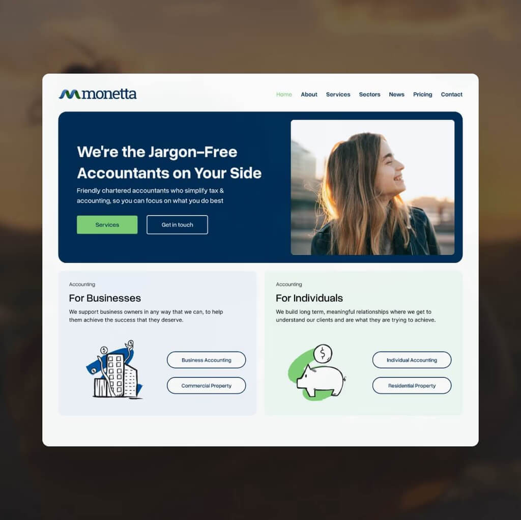
Sixty years of trusted accountancy across Manchester and Liverpool and a website that didn't come close to reflecting it. Monetta's offline reputation was rock solid. Online, it was a different story. This project was completed during my time as lead web designer and developer at Mary Agency.
Challenge
When Monetta came to me, the brief was clear, their digital presence no longer reflected who they were or what they stood for.
The existing site had no real UX design thinking behind it. Navigation was cluttered, the user journey was almost impossible to follow, and there was nothing guiding visitors toward making an enquiry. For a firm with 60 years of trust behind them, the website was working against them.
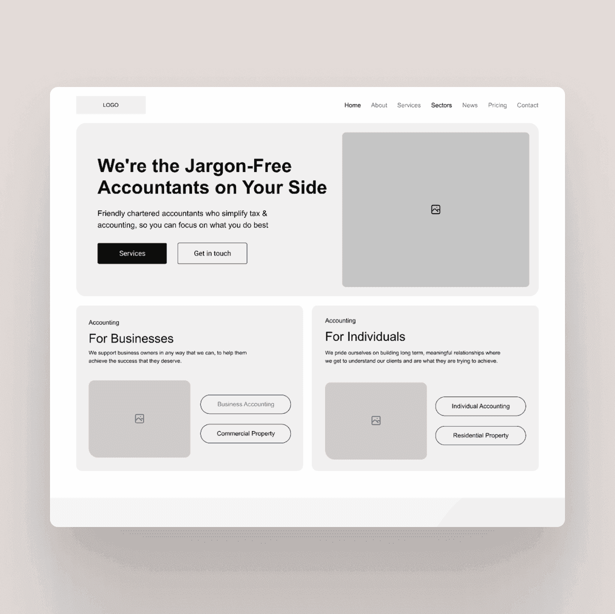
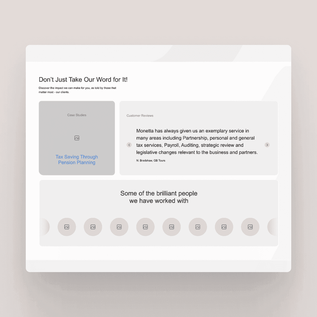
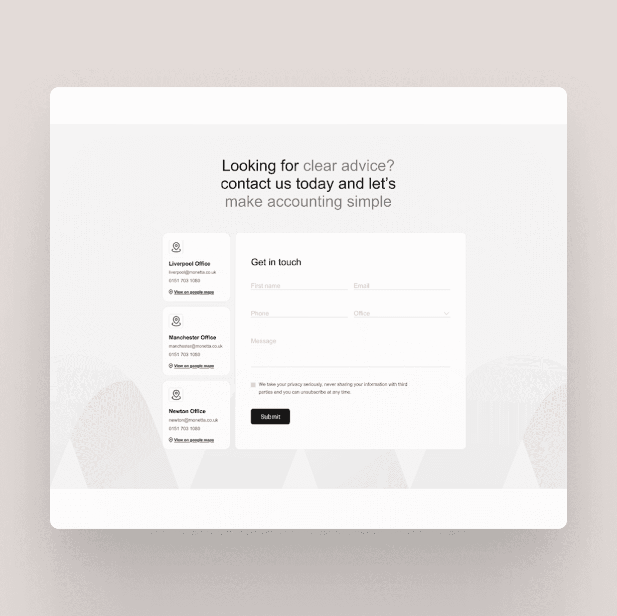
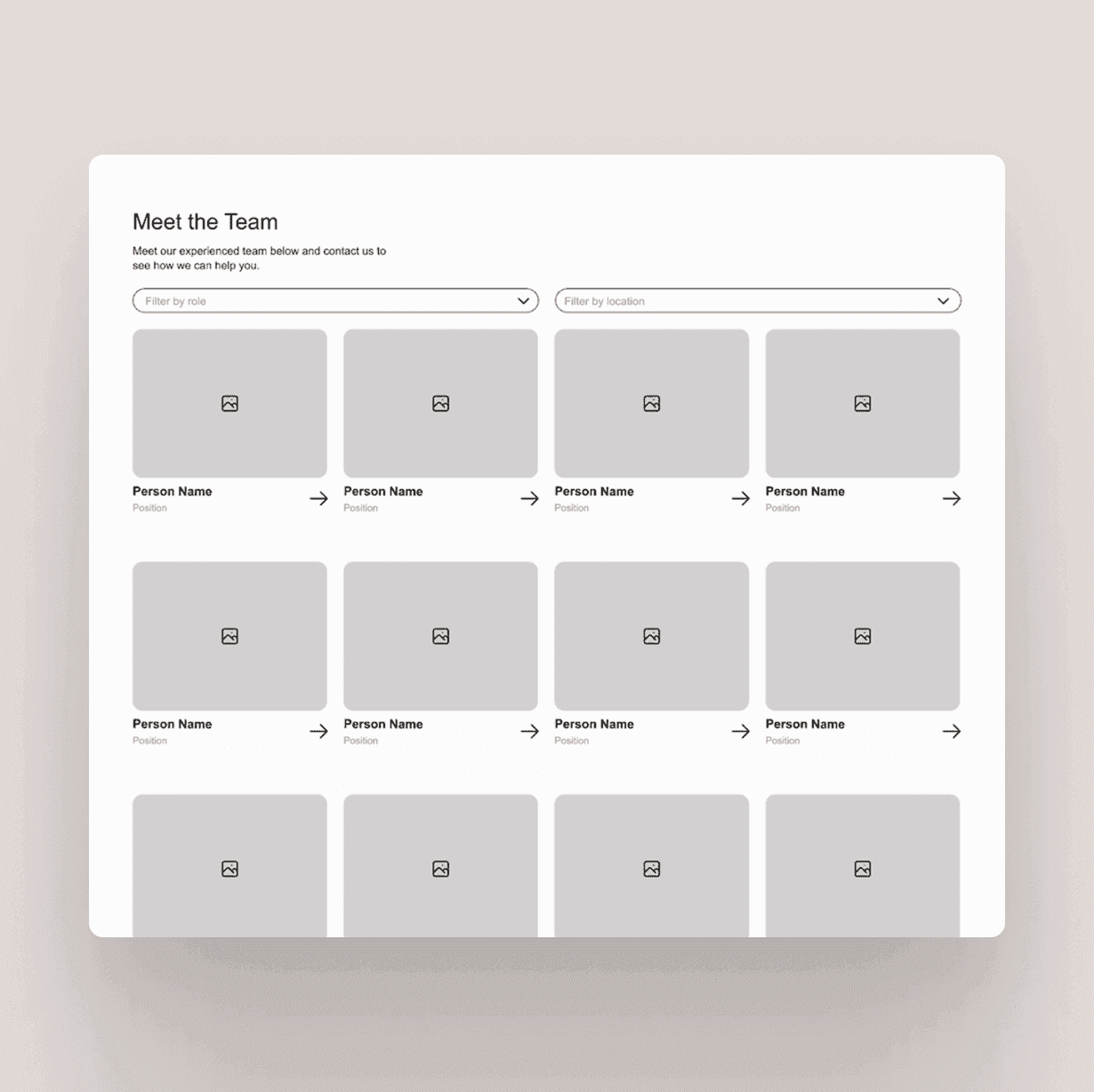
Detailed wireframes and user journey mapping uncovered the root issues and gave us a clear roadmap for what needed to change.
Pain points
A design that no longer reflected who Monetta are
Navigation that left visitors guessing where to go next
No logical flow to guide someone from landing to enquiring
Calls-to-action that were easy to miss and hard to act on
Results
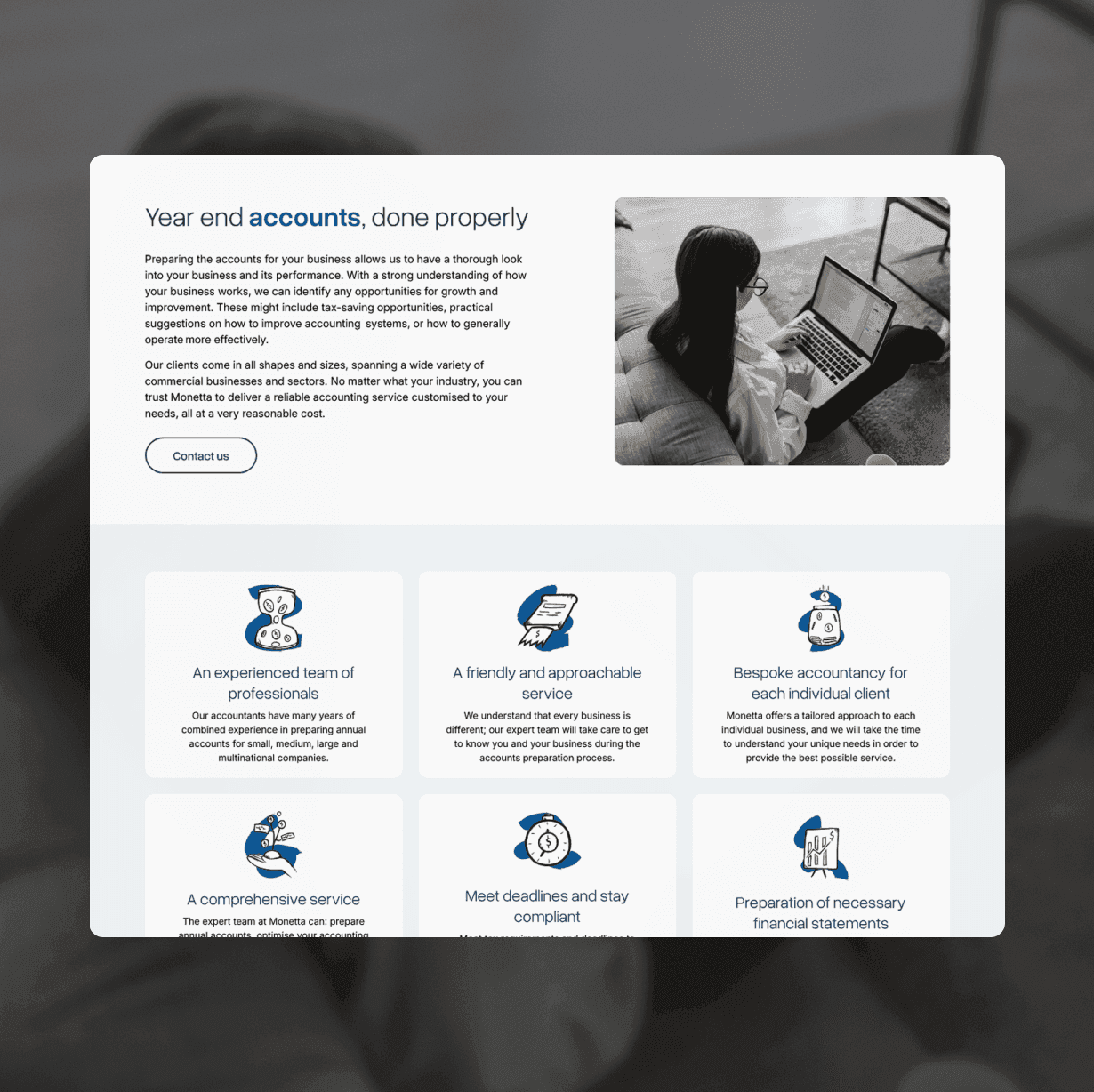
The solution started with considered web design stripping everything back and rebuilding around how real people actually use an accountancy website.
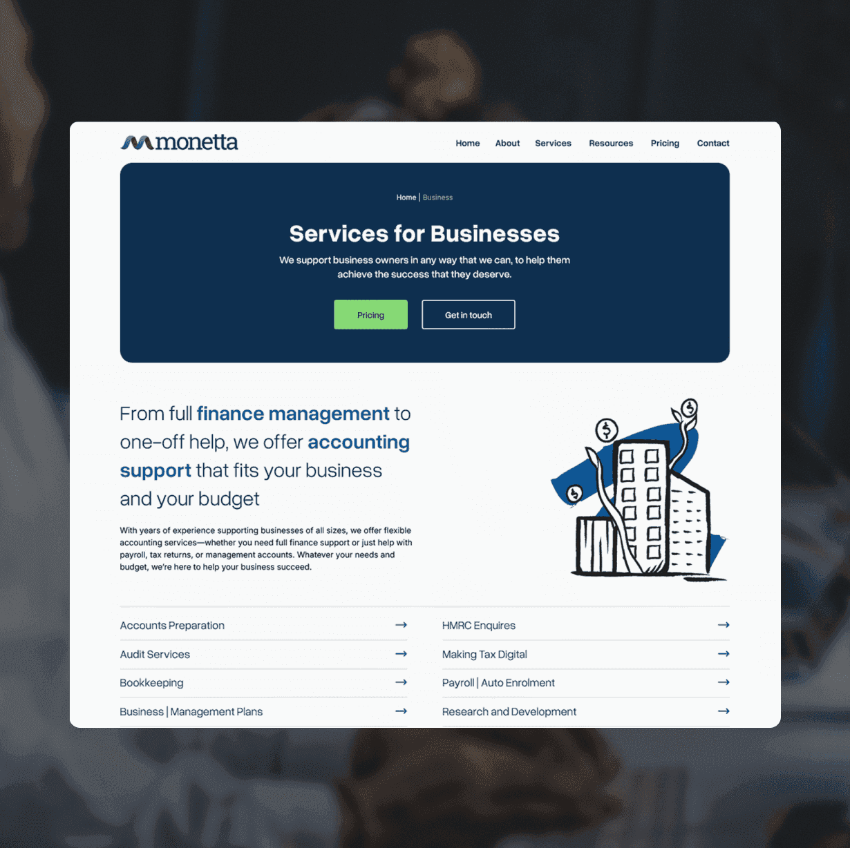
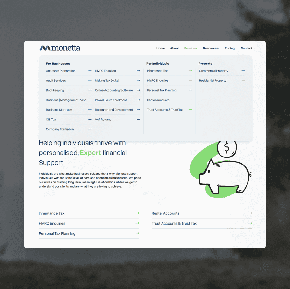
Services were restructured and clearly divided between business and individual clients, making it immediately obvious where each visitor should go. A colour-coding system reinforces that separation at a glance, reducing confusion before a single word is read.
From there, the web development brought it all to life in WordPress built for speed, accessibility, and ease of use on any device. Navigation was rebuilt as a simplified mega menu, giving users direct access to key services without friction. Content was streamlined so every section earns its place, and CTAs were positioned where people actually need them not just dropped in as an afterthought.
The result is a website that finally does justice to everything Monetta have built over the last 60 years.
Quick Notes
A modern design that finally matches Monetta's reputation
A colour-coded system that instantly separates business and individual services
Content stripped back so every word earns its place
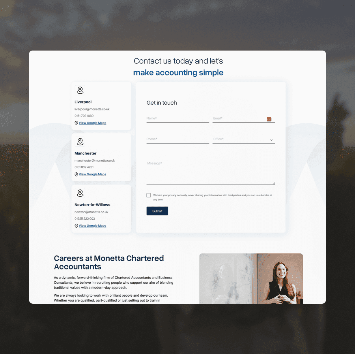
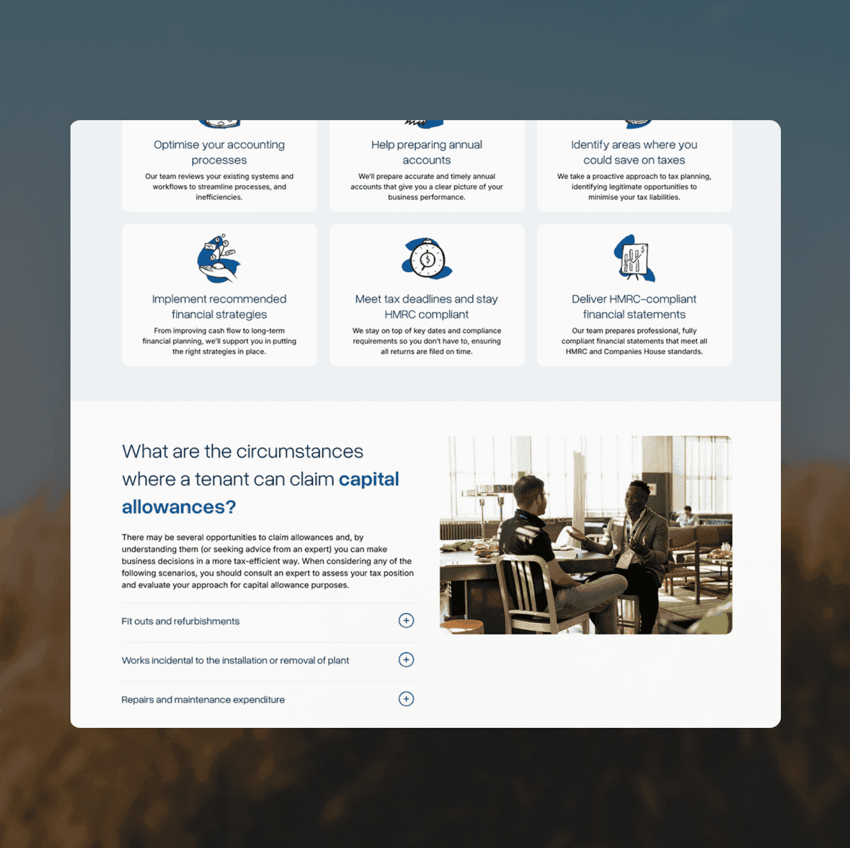
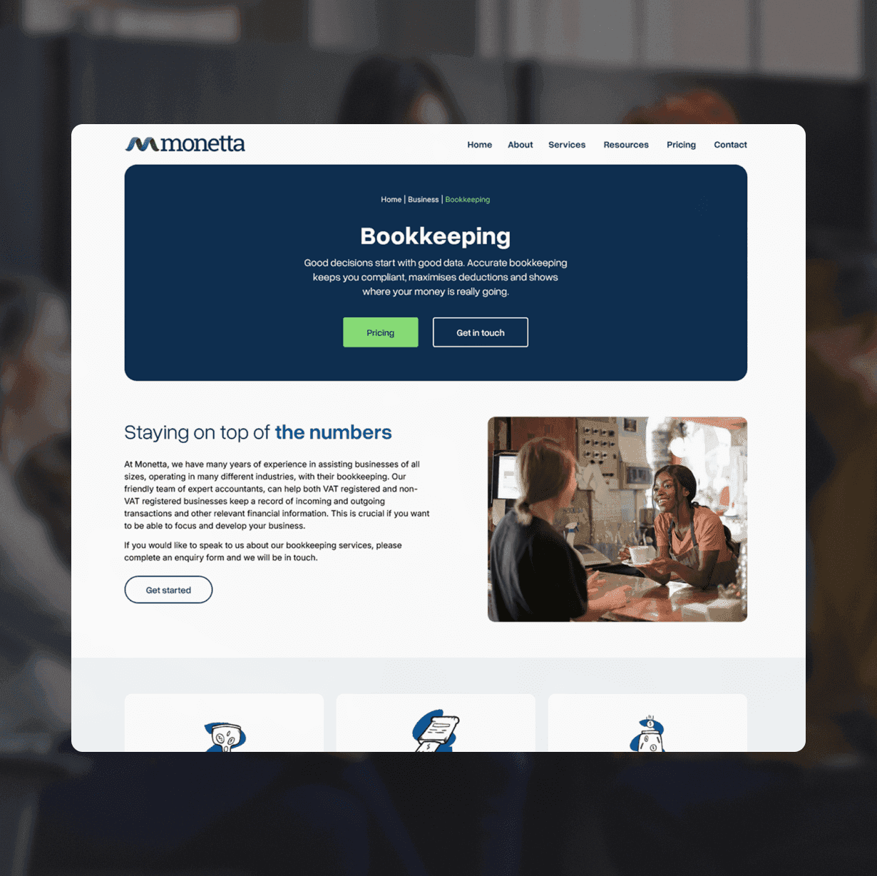
From confusion to clarity, I helped Monetta create a digital presence that’s as professional, approachable, and trustworthy as the services they provide.
Contact
I’d love to hear about your project

Book a discovery call
Let's have a 15 min call to discuss your project.